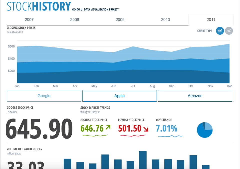
Kendo UI is a JavaScript UI toolkit that allows users to build responsive web-based apps integrated into their framework of choice (jQuery, Angular, React, or Vue). The vendor’s value proposition is that Kendo UI offers a large library of popular and configurable components ranging from sophisticated grids and charts to basic buttons, so users don’t have to waste development time building their UI. The vendor also says the large library of customizable themes means users can easily deploy a…
$999
per developer, royalty-free
Qlik Analytics Platform
Score 8.2 out of 10
N/A
The Qlik Analytics Platform (QAP) is a developer platform for building custom analytic applications based on rich frontend and backend APIs. It gives full API access to the Qlik associative engine to build rich data-driven analytic applications, for example when building web applications for extranet and Internet deployment.
Kendo UI works well if developing web UI applications which have simple layout designs. - Good A scenario where there are a lot of Kendo widgets on a single UI page, and each has a complex initialization. - Not so good
If you want to setup analytics dashboards for reporting or simple data analysis then Qlik is your tool of choice.
Complex data structures are handled well, but you’ll need to keep de amount of data on the low side. Integration with other software is possible and easy.
Kendo Grid for presenting a timeline of research grants as they are being approved. Our users love the ability to export the data to various mime formats.
Kendo Scheduler for presenting the upcoming calendar events in the available conference rooms in a building. This is used together with a 3rd party vendor API for appointment booking.
Kendo Treeview is used to present a hierarchy of topics that our users can navigate through easily.
It's flexible in allowing the development of fully-fledged analysis tools and dashboards, but also smaller "widgets" to embed in our websites to bring stories to life, and enables us to develop things once and then re-use them in different contexts.
The development platform and management console are both easy to use, and, with proper data development by our expert developers, can be used by relatively junior colleagues to produce great-looking and very useful products.
The way the platform handles a mix of data sources from different APIs and internal data stores is good.
We like the visualizations and from a corporate perspective find it easy to develop one-size-fits-all visualizations that present a wide range of data items well in a responsive way.
Kendo UI is always moving forward and staying current with latest development trends. While that is beneficial, that can cause some issues when supporting customers (particularly government) that don't move their IT infrastructure along nearly as fast. A prime example is web font icons. Great and easy to use, but where Kendo UI utilizes web font icons as the sole means of displaying an icon, not all organizations (again, especially government) allow the use of these. There have been times where Kendo UI became unusable and we had to downgrade to a version a few years old. Makes continued payment for licenses sometimes feel wasted as we may not be able to always use the new releases
Kendo UI has a wonderful feedback system and they do indeed listen to the community. However, there do seem to be some instances where there is large support for a new feature/component and it never gets addressed. It is easy to understand that not all ideas are easy or even prudent to implement, but would be nice to see a better follow-up on ideas with a current status
Refreshing Kendo UI grids is simple, yet the standard API method causes the grid to return to the default state. We have many use cases where we would love to update the grid data but need current grid state (such as expanded detail rows, sorts, filters, etc) preserved after the grid is updated so that users do not have to perform grid actions again to return to the desired state.
Since we are using Kendo on a legacy product, there is likely a time when we will no longer support it. We are evaluating Kendo for our future product, in which case we may continue to use Kendo for an extended period of time.
My initial score would be 10, but I am aware of the high price for its implementation. Therefore, I would recommend it only in large projects where a large profit margin can be obtained. But in general, I recommend it. I am currently using it without problems.
Overall, we are satisfied with the support offered by the Progress Kendo UI team. We had raised few helpline incidents in the past and they have been resolved timely by the team. Also, we were satisfied with the level of information and support provided by the team.
Qlik is great for companies with lots of business domains and departments because it scales well, especially if data that is reported is saved in SQL and similar structures. Its ease of use and good UI enables business units to create and manage their own reports. That removes a great burden of creating and managing/modifying these pages from the IT team. Overall, it's a win-win for both IT and business units.
I think the main thing is to get into a Kendo mindset. Components that I've used in the past had a much different mindset and I think it got in my way. Sometimes I would use something different if I felt that the Kendo component was being too obstinate. I would go back later and replace that with the Kendo component when I had time to work with it further.
I did not experience the other product that has such an integrated and user-friendly feature. It works more like an everyday query with the UI element in a totally aesthetic and attractive view. With the Kendo library, we don't need to develop every UI component from the beginning. It was one of the faster development of applications.
They are all good tools, each having their own pros and cons. Qlik Analytics Platform was easy to set up, more than affordable, and has a good user base. Though not as large as some of the other tools, it is growing every day and for the price, it is very hard to beat. I would recommend it. Microsoft Power BI is a little more intuitive to some users, many of them engineers, because of its similarities to Excel. I do like that it follows a similar structure to Excel but I think that it also has the same old-school GUI, which could be improved on. I prefer the way Qlik Analytics Platform's visualizations look because they appear more modern and smooth rather than rigid.
Positive impact is that it helps development team to focus on business logic rather than developing UI control and that resulted in good productivity savings. productivity saving is significant (like 30% of product development cost).