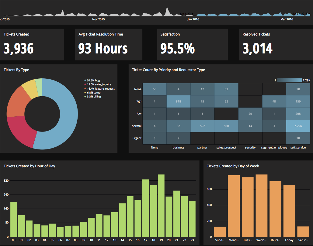
Chartio is a visualization tool designed to enable anyone to explore, transform and visualize data on the fly through a drag-and-drop interface. Chartio was acquired by Atlassian in February 2021 so that it's capabilities could be integrated into the Atlassian product portfolio's capabilities. Chartio is no longer available to new customers, standalone. Existing customers must migrate to alternatives by March 2022, when the service will be retired.
$40
per user/per month
Mode
Score 8.1 out of 10
N/A
Mode, or Mode Analytics, from ThoughtSpot since the June 2023 acquisition, is a business intelligence platform that unifies company analytics by bringing data teams and business teams together, so analysts can provide rapid answers to strategic, ad hoc questions. And, business stakeholder can access relevant data to answer their own questions which can often detract more impactful work.
I've honestly never really seen another product like Chartio. The closest I can compare is 6sense, but it's fairly different. I think 6sense and Chartio work well together.
Chartio so far has been the easiest BI tool to setup and has also been the most affordable. There are some other, great, BI tools out there but they were a bit to heavy handed for what we needed. Also - despite the high cost per user in Chartio, the other tools were still more …
We used GoodData before Chartio. Our main reason for the change was that GoodData also stored our data and we could not query our own databases. We had to load the data first before creating a new dashboard which made the whole process (and also the maintenance) more difficult. …
Initially, we selected chartio because it was the easiest to connect to data and get going making visualizations. Ultimately, we moved away from Chartio because we needed a tool that would work as a buffer between our data structure and the visualizations. But majority of BI …
Again, Chartio provides the best multi-user presentation ability for us. Other tools are great for slicing and dicing the data, but at the end, you still have to spend time trying to find a way to present it. Chartio has that built in.
Simple interface, simple dashboarding (very little ETL or Analysis requirement for our purposes) and ease of self-service and quick support response. The price was right for all of these things.
It's so much more customizable and allows you to use any data you could possibly want. The interface is also so much more sensible and allows you to decide how to look at things.
We have an older version of Crystal Reports that just hung around as the company grew. Now that we have more users, it's not feasible to continue with the limited Crystal experts that we have in order to get reporting out across the entire company. What we were aiming for was a …
I tried a number of competitors before selecting Chartio. Duckboard is a mess. Looker is an exciting product but requires a huge amount of configuration. Most enterprise solutions have been featurecreeped to death and all look like Excel circa 1998. We selected Chartio because …
I kind of hit on this earlier, but simply put: Usability. We were given tutorials by our Data Science team using Birst, and even they encountered a few hiccups explaining things: they use this everyday! We trialed Chartio with people having zero BI software experience and they …
Tableau is a huge pain to edit or create dashboards, by comparison. It can make better looking visualizations, but in practice, letting users drill down and change dimensions slows the end user experience so much that it's often not worth it.
I've used other BI tools such as Spotfire and Mode is by far the better solution. It is far more stable, less susceptible to errors/needs to reload/re-format reports, and overall more user-friendly. Spotfire might have some deeper functionality for absolute power users, but for …
Mode Analytics is better for us than most -- because of its white-label feature, its security-first posture, and the fact that you can go directly to SQL.
In my opinion Mode Analytics has an edge on much of the competition due to the intuitive and powerful custom dashboard creation interface. I can create dashboards for stakeholders that are self explanatory and easy to make conclusions from. In other respects, it's very much at …
Mode [Analytics] has a shorter learning curve and is better for starter analysts who are not yet Python fluent. They also require very little setup for report viewers to consume data, making it a more optimal solution for team members on the ground.
Mode is the best for the advanced user with advanced use cases. Even creating a simple report will require an SQL query. No drag-and-drop interface for querying data. But it is best for the advanced user already familiar with Python or R and SQL. The other products are more …
This product is well suited for end users that don't want to get too in depth with reporting. The interface is simple and the default filter options are sufficient for a general report. Example: Total Sum of Net Sales for all products sold in X State between dates X and X. If the need is for a more complex query, then there is the Custom Query option. This would be something that an administrator would have to police as having users writing their own queries could get really messy really fast. I suppose the key questions to ask would be: Do you need a product that will... display all relevant charts/reports in one consistent place? ... be simple for an end user to navigate? ...be web-based and remotely accessed?
After launching a new contact pathway in a help experience, Mode Analytics can help provide insight into the sentiments from users as well as the engagement with any written content. Numeric outputs are easier to manage, whereas more nuanced/emotional feedback is sometimes hard to quantify (though not impossible if you get creative).
Constantly updating: many of the BI tools we looked at were slow to iterate on their product. This was a main selling point for us.
Ease of Use: We have many users that are new to BIs tools and database management in general. BI software as a whole has a pretty steep learning curve for most people, but Chartio does a good job of making things easier all around.
Database Support: It seems as though every department insists on storing their information using different databases. Chartio had support for everyone one we needed which was very helpful.
It has become a core part of the business in terms of identifying the health of our network. If we grow and there are certain things that might not fit well with Chartio (e.g. we'd want to store snapshots of every single day's dash instead of seeing realtime data), it might make sense to move some of the data analysis tool in-house if resources are available.
I really like using Chartio. I use it on a daily basis for pulling data from different sources and combining data (the explore tab was a great idea for this use). I think I would give it 8/10 because there needs to be more documentation or maybe blog posts about things people are doing with it. I only have my own ideas about what to do /how to graph things. I know there are some articles, but it would be awesome to have a section on the neat dashboards people are building or how they show data in different ways. Another complaint is how much time it takes to load. I know our databases aren't set up precisely for Chartio and I have been creating data stores. But the data stores have so many more limitations that adds a whole new layer of frustration. Love the product, keep up the good work and the fast fixes.
I use self learning materials. Pretty helpful. I find myself having to go back to the "drilldown" instructions though, and have a hard time finding hidden variables on a dashboard, so perhaps there is room for intuitive improvements (or maybe I'm just being lazy)
Again, Chartio provides the best multi-user presentation ability for us. Other tools are great for slicing and dicing the data, but at the end, you still have to spend time trying to find a way to present it. Chartio has that built in.
Tableau is a huge pain to edit or create dashboards, by comparison. It can make better looking visualizations, but in practice, letting users drill down and change dimensions slows the end user experience so much that it's often not worth it.
Looker is amazing for data modeling, but you have to get your whole business all in on it to take advantage. Viz capabilities are similar.
Databricks has a lot of functionality overlap, but the visualizations are terrible. Databricks' great strength is that you can use notebooks to do anything with code.
Chartio has worked well as our datawarehouse has rapidly expanded, and the usability/performance hasn't seemed to have suffered. What we haven't yet realized is additional savings from additional users. We have some dashboard needs for users who truly just view of a few charts, and the licensing structure hasn't yet been structured in a way that would support that type of approach...having 50 "core" licenses, and then potentially several hundred view only licenses for partners that would use the application infrequently.
It has allowed us to monitor ongoing financial transactions written to our SQL data tables in real-time and that helps us to monitor user transaction activities in real-time
Using Mode we have been able to also track users who undertake fraudulent financial transactions; preventing financial losses to our users
Mode's collaborative abilities have been very helpful in sharing transaction monitoring workload across our compliance and cybersecurity team